
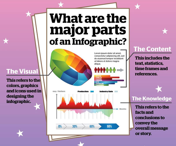
The Anatomy Of An Infographic: How To Make & Master Your Message
Here at Embrace Disruption PR it is no secret that we love the infographic. Those creative representations of statistics not only present data in a way that is visually appealing, but they are also informative and extremely easy to read. But for all the infographics we post around here, we’ve never really posted about what makes a good infographic vs. one that just doesn’t make the cut. Read on for some helpful tips and pointers if you have ever wanted to create top-tier infographics. Thanks Fast Company for the inspiration & information for this post!
Data Collection
The original idea for an infographic often comes from a question someone poses or a pile of information they have collected. After the original source of information/data for a potential infographic is identified, it is time to start branching out to other sources. The idea is to create the complete picture and landscape of the given situation so that there are no holes in the data. If a hole exists in the data, it is only going to frustrate everyone and waste time when it has to be filled in the future.
Formulating the Outline
The purpose of an infographic is to convey a story to the people who come across it. A bunch of seemingly unconnected facts and figures aren’t going to appeal to someone in the way the statistics behind one particular, central topic are. For example, we posted an infographic a couple months ago about the Grammys winners if awards were given out based on online/social media presence; there was a lot of information but it was all on one topic. The worst thing that could happen is having all the boring data translate to a boring infographic.
Here’s a tip: make sure you know the information & data backwards and forwards by the time you go and create the infographic, this will make it easier to flush out a story.
Trouble Shoot
So you know what you want the infographic to say but is it feasible given the data you’ve collected? The last thing you want to do is mislead people looking at the finished product by intentionally leaving out data because it doesn’t support the story. What you do want to do is present the data picture in its entirety and let the viewers and readers interpret it. You want their response to be, “I know what they are trying to say, and this is what I’m gathering from this infographic.”
Finding the “Hero”
You have figured out the story you want to tell with your data and if it is feasible or not, now to figure out which specific piece of information to make your ‘hero’ piece of data. The ‘hero’ piece of data is that one statistic or figure that will get people excited about the story. It will be the focal point that the other chosen data will revolve around to help communicate the narrative to the audience.
Building the Graphic
After the hierarchy for the data is determined, the visual representation of the infographic begins to take shape. There are many popular formats for displaying data, including the traditional graphs and charts. If the data merits it, you can choose to display the data using diagrams, flowcharts or maps. The deciding factor of how the data should be displayed in the final project all depends on the data itself and the story to be conveyed. To make the most of the visual appeal of the infographic, be sure to consider the colours and typography used.
A Thorough Going Over
So the design of the infographic is complete and all the data is displayed, you’re done right? Wait, slow down a little, there is one more step before your informative masterpiece can be unleashed to the masses: editing & revisions. Just like any good report, press release or company project, an infographic needs to be pored over by those who created it, and those who didn’t! The infographic should be made to fit in with any existing branding or identity; why would a company create an infographic that goes against part/all of their core message? Additionally, you want to ensure the data is presented in a way that is easy to read and understand for those that are unfamiliar with it. That is why you want those outside the creative circle who developed it to look it over.
Release the Beast
Finally, the time has come to unleash your infographic onto the public at large! Most infographics are released and shared online in some fashion, they may end up in a print publication as well. The advantage to this is that the audience of your work will be much larger and reach those both within your target audience and beyond. It is also easier to garner and compile feedback to the infographic in an online setting, often in a much timelier manner than print. Feedback after publishing can generate discussion & illuminate a different dimension to the data presented.
But once the infographic is published, don’t forget about it. You spent all this time and effort to create it in the first place, why let that go to waste if new data is released? Make sure you keep tabs on the important information and sources to update and revise the infographic as required. It’s easier to update than to create a whole to project!
So there you have it, a detailed, step-by-step guide to creating effective, appealing infographics to engage your audience. Now get busy creating!


Leave a Reply
Want to join the discussion?Feel free to contribute!